Details
-
Sub-task
-
Resolution: Unresolved
-
Minor
-
xCM 6.0.0
-
None
Description
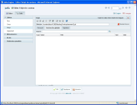
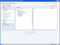
It would be nice to unify the UI between the file picker and the category picker. Especially in term of tabs and manners of looksing for content.
Ideally spekaing the category tree (if the current editor has RW or RWA access on nodes) should be editable directly from within the category picker (similar to file picker). Both interface should then look like quite similar (Excepted the dual view in the main panel).
In the short term at least a label on the search/auto-completion form could be nice.

